UX · UI · Design System · Product Thinking
Overview
Partnering with a group of seasoned founders and developers, I helped design and launch a brand-new online gaming platform from the ground up, in just three months. As the sole product designer on the team, I led everything from user flows and prototyping to interface design and design system architecture.
This was a high-velocity, startup-style project with tight iteration loops, daily decision-making, and a bold ambition: to ship a polished, scalable product that could power multiple brands within the same group and meet all legal and accessibility standards from day one.
My Role
End-to-end UX & UI
I was responsible for the full user experience across desktop and mobile, designing core flows for onboarding, lobby, sportsbook, casino, and account management. Every screen was built with a strong visual identity, intuitive structure, and clear hierarchy.
Scalable design system
I created a full design system and component library in Figma, including tokenized styles, responsive layouts, and interaction rules. It’s built to support future brand spin-offs and integrates tightly with Storybook for handoff and collaboration.
Product structure & scalability
From the start, I worked closely with stakeholders to ensure the platform’s architecture could scale. I mapped out flexible structures for navigation, content, and logic across multiple markets and skins.
Microinteractions & motion design
Using my background in motion and brand design, I shaped the product feel through animations and subtle interactions – keeping the experience snappy, smooth, and full of personality without being overwhelming.
Accessibility & compliance
Every detail followed accessibility best practices (WCAG) and local gaming regulations. I ensured clear focus flows, readable contrast levels, accessible touch targets, and proper keyboard behavior – from early wireframes to final components.
Rapid collaboration & iteration
Working side-by-side with developers and product leads, we prototyped, shipped, and refined at speed. I ran design reviews, shared updates daily, and adapted flows based on stakeholder feedback and technical constraints in real time.
Outcome
🚀 Fully functional MVP launched in under 90 days
🧱 Modular design system set up for multiple brands
🎯 Clear, fast, and fun UX that balances playfulness with precision
✅ Built-in accessibility and legal compliance from day one
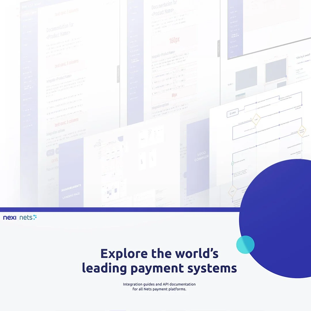
I led the redesign of an underutilized Nordic developer portal, transforming it into Nexi Group’s primary documentation hub. The project aimed to create a cohesive, user-friendly experience that served a diverse, global audience—while scaling up to onboard new products.
Key Challenges
- Inconsistent Structure: The portal lacked oversight, leading to a fragmented user experience.
- Global Adaptation: It needed to accommodate diverse regional needs while maintaining a unified structure.
- Unclear User Base: No existing user mapping meant we were designing without a clear understanding of the audience.
- Scaling While Rebuilding: The portal had to support new product documentation while being redesigned in phases.
Research & Insights
- User Research: Conducted interviews, surveys, and behavior tracking (via Hotjar) to gather qualitative and quantitative insights.
- Competitive Analysis: Benchmarked leading documentation portals to identify best practices.
- User Mapping: Discovered that beyond developers, key users included product owners, sales teams, and Nets customers looking for support. This insight shaped both content strategy and design.
Design Process & Execution
- Wireframing & Prototyping: Developed and refined interactive prototypes through iterative testing.
- User Flows: Streamlined navigation to make documentation and support resources more accessible.
- Cross-functional Collaboration: Worked closely with the support team and tech writers to onboard new products while rebuilding the portal in phases.
- Full-scale Redesign: Implemented a new UI aligned with Nexi’s brand guidelines and integrated their component library for consistency.
- Content Strategy: Adapted documentation based on user needs, improving clarity and usability.
- Support System Enhancements: Strengthened support integration for more seamless user interactions.
Impact
- Improved Usability: A clearer structure and navigation significantly enhanced user experience.
- Higher Engagement: Increased time spent on key pages and more efficient access to critical documentation.
- Scalability Achieved: Successfully onboarded new product documentation while modernizing the platform.
- Positive Feedback: Users reported better accessibility and an overall improved experience.
Objective: Design and build a new, seamless checkout experience integrating Click to Pay, compatible with Mastercard, Visa, American Express, and Discover.
Timeline: 7 months
Key Challenges
- Minimizing Friction: Balancing security with ease of use to prevent abandoned purchases.
- Technical Complexity: Unifying diverse card network requirements into a single integration.
Full Checkout Redesign: Simultaneously building a new checkout system while implementing Click to Pay.
Research and Discovery
- User Research: Conducted interviews and behavior analysis to identify pain points and optimize flows.
- Competitive Analysis: Benchmarked existing checkout solutions to identify best practices and improvement areas.
Design Process
- Wireframing & Prototyping: Mapped user journeys and developed interactive prototypes for validation.
- User Flows: Designed intuitive flows for onboarding, account verification, and card management to minimize friction.
- Iterative Testing: Continuously refined the design based on user feedback and technical constraints.
- End-to-End Development: Built a new checkout system alongside Click to Pay, ensuring a unified and scalable solution.
Key Features and Solutions
- End-to-End Development: Built the checkout system from the ground up, aligning with the EU Accessibility Act 2025.
- Seamless User Experience: Developed UI that guides users through the payment process. Ensured compatibility across various devices and payment networks.
Results and Impact
- Efficient Delivery: Successfully launched within 7 months, streamlining both checkout and Click to Pay integration.
- Positive Reception: Early feedback indicates improved usability and reduced drop-offs.
Role
Designer | Art Director
Client
HBO Nordic and HBO España
Agency
Wunderman Scandinavia
Background + Challenge
HBO needed a scalable, user-friendly CRM email template that enhanced engagement and gathered insights. The challenge was overcoming technical constraints to create a seamless, frictionless experience that reinforced brand consistency and drove business opportunities.
Solution
We pushed technical boundaries to create a first-of-its-kind modular master template with dynamic content blocks, optimizing usability and engagement.
- The Slider – Enabled fluid storytelling by seamlessly presenting multiple stories.
- The Hover – Created a more dynamic visual hierarchy, allowing images to take center stage and making content more immersive.
- The Fold Out – Allowed users to explore content without leaving the email, reducing friction and improving discoverability.
By prioritizing user needs and refining the design through testing and collaboration with HBO, we ensured an intuitive and scalable solution.
Impact
- Seamless User Experience – Reduced friction and enhanced content engagement.
- Business Growth – Strengthened brand consistency and expanded opportunities for targeted communication.
- Scalable & Future-Proof – Created a flexible system adaptable for evolving campaign needs.
Role
Designer | Art Director | Illustrator
Partner in crime
Mattias Mattisson
Client
Trygg Hansa + Bris
Agency
Perfect Fools
Background + Challenge:
In 2020, a report by the Public Health Agency (FHM) highlighted alarming mental health statistics among Swedish youth, with 54% experiencing anxiety, worry, or stress, and 13% facing severe issues. Recognizing this, effective interventions became essential.
Solution:
Trygg-Hansa and Bris initiated "För Alla Unga" (For All Youth), a digital education program aimed at high school students. This program, developed with psychologists, educators, and organizations like Bris, UNICEF, and Tilia, offers educational material on mental health, stress management, and well-being. Throughout the project, we worked closely with the client, engaging in regular feedback sessions and user testing with students and teachers. This user-centered design approach ensured the program effectively addressed the needs of its users, allowing for continuous improvement and adaptation based on real-world use and feedback.
För Alla Unga (For All Youth):
Tailored for high school students, this collaborative effort includes input from students and teachers through focus groups and user testing. The program is designed to be intuitive and engaging, with an emphasis on accessibility and user experience. Educators, parents, and youth leaders are also supported with preparatory training modules to identify and address mental health issues early.
Impact + feedback
The initiative has actively engaged students, ensuring the program meets their needs and incorporates continuous feedback for improvement. The visual identity and user interface align with the program’s goal to be supportive and empowering.
Visit För alla unga
Role
Designer | Art Director
Partner in crime
Mattias Mattisson
Client
Halebop
Agency
Perfect Fools
In collaboration with my great partner in crime, Mattias, we worked on revitalizing and extending Halebop's graphic identity. Our mission was to modernize the brand's visual language and adapt it for seamless integration across various communication platforms, including digital media, audio, social media, television, and radio. The challenge was not only to create a standout brand presence that could effectively capture and retain audience attention in a crowded market but also to distinguish Halebop as more than just a phone operator. The result is a cohesive and dynamic brand identity that resonates with audiences on multiple levels, enhancing Halebop's visibility and impact in today’s competitive media landscape, and positioning it as a unique and innovative player in the industry.
Role
Designer | Art Director
Client
Telenor
Agency
Wunderman Scandinavia
Background + Challenge
With email marketing evolving from a broadcast channel to a highly personalized platform, Telenor needed a master email template for its brands: Telenor consumer, Telenor business, and Bredbandsbolaget. The goal was to create flexible templates that enhance user experience, improve customer engagement, and support re-branding efforts.
Solution
We developed a master email template featuring various flexible blocks and sections. This design approach allowed for consistent branding while enabling customization for different campaigns. We worked closely with Telenor, engaging in regular feedback sessions and user testing, ensuring the templates were user-friendly and met all client requirements.
Collaboration + Continuous Development
We maintained a user-centered design approach, continuously refining the templates based on user feedback and client input. This iterative process ensured the final product effectively addressed user needs and aligned with Telenor's branding guidelines.
Impact + feedback
The master email template facilitated the creation of diverse email campaigns, improved customer experience, and enhanced engagement. The collaborative and continuous development led to a flexible solution that met Telenor's evolving marketing needs.
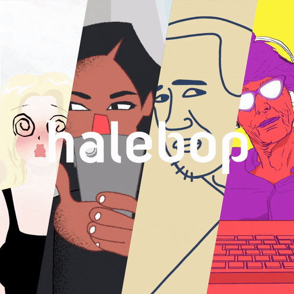
O-Matcharen / The Unmatch is a phone service that paired people up to their total opposites. To market O-Matcharen, Halebop created four podcast episodes where eight Swedish influencers were matched in conversation to their characteristical opposite. Anita "Lady Silver Looström to Janice Kavander, Julia Frändfors to Edward Blom, Alexandra Nilsson to Badou Jack, and Parham to Per Holknekt. I then illustrated and animated 20, 15 and 10 second snippets that rolled out in social media.
Role
Designer | Art Director | Illustrator | Animator
App design
Mattias Mattisson
Client
Halebop
Agency
Perfect Fools
Sveriges Utbildningsradio (the Swedish Educational Broadcasting Company), founded in 1978, is a Swedish public-service corporation dedicated to educational programming on radio and television. I was asked to host an educational TV program produced by UR that would be used when teaching Italian in Swedish and German schools. We created 10 episodes, each focusing on a unique aspect of Italy, from food culture to family life.
Role
Host
Client
Sveriges Utbildningsradio (UR) & Munck
Agency
Freelance
I was asked to create inspirational conceptual art to visualise the look and feel of a new online gambling company called Voodoo Dreams. The sketches were also used as storyboard when creating their commercial ads.
See the TV ads here
Role
Art Director | Illustrator
Client
DDB House
Agency
Freelance
For almost 15 years Windows XP remained a highly relevant operating system for business computers. But when extended support ended and the operating system ceased to receive further security updates, many business computers needed to be updated or replaced.
Our task was to adress those still working with Windows XP and help them convince their bosses of buying them new computers. We created a campaign site where you were handed all sorts of material; memes showing the feeling of having to work on an outdated computer, old fashion presentations, articles with scientific and "real" arguments. The campaign spread through banners, ads and social media.
A major challenge was to create an aesthetic look that visually gave an outdated feeling, showing the working conditions those using the Windows XP operating system dealt with. Most of the material provided on the campaign site is designed to look antique and to give a "This-is-the-best-I-can-do-with-what-I-have,-give-me-a-new-computer"-kind of feeling.
Role
Designer | Art Director
Client
Microsoft Sweden
Agency
Wunderman Scandinavia
Founded in 1998, Åkestam Holst has established a position among the top acclaimed advertising agencies in Sweden. I was assigned to revisit the agency's presentation templates, showing their history, working process and mindset.
Role
Illustrator
Client
Åkestam Holst Promenad
Agency
Freelance