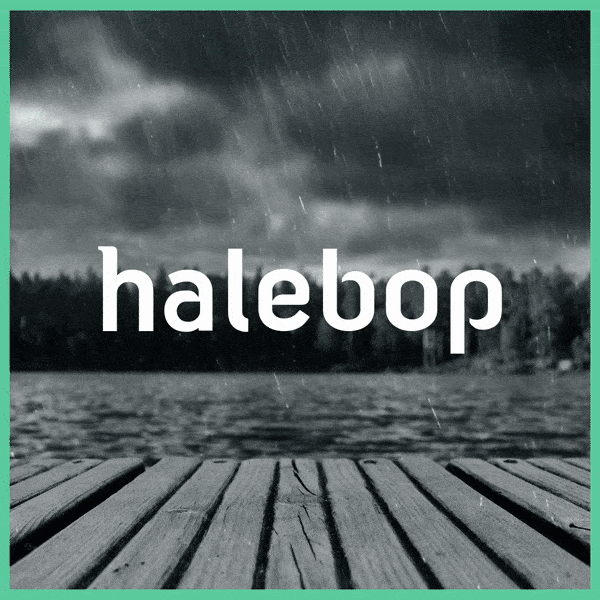
Overview
This was not a logo refresh. It was a rebuild of what Halebop could be as a brand. The ambition was not just to make it work better across touchpoints, but to give it more life, more range, and more cultural weight. We explored how the brand moved, sounded, felt, and showed up in the world, so it could become more than a phone brand and start behaving like a living one.
The challenge
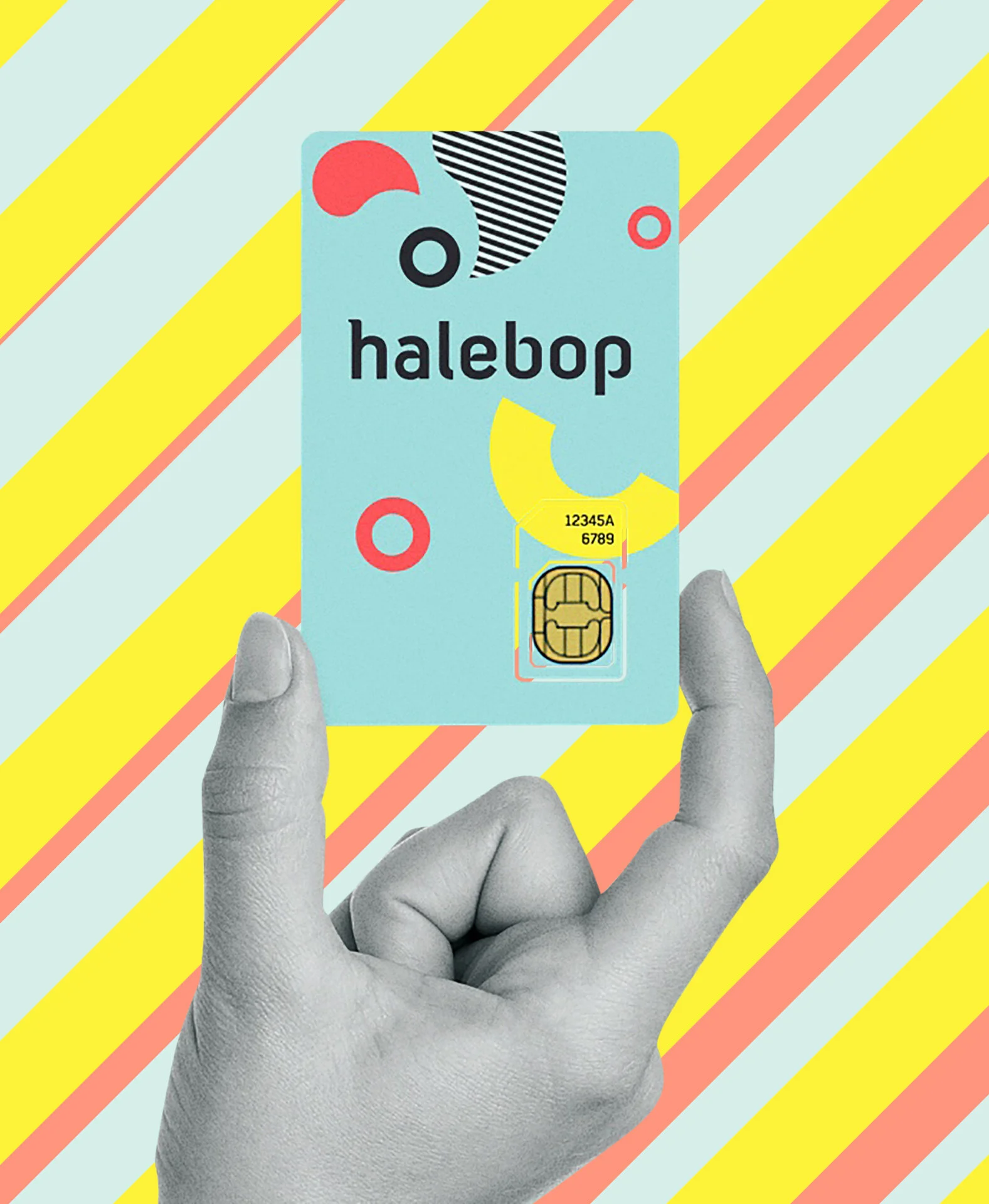
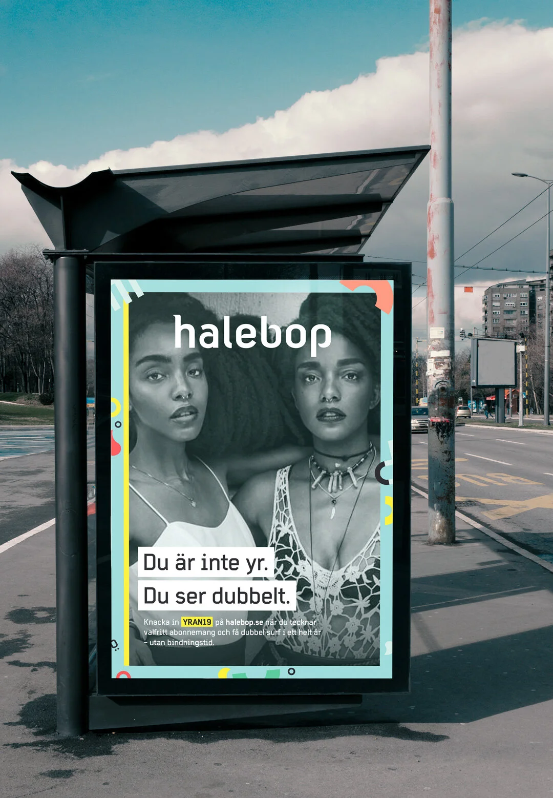
Halebop already stood out, but the old identity was starting to feel too limited for a digital world. It needed more energy, more flexibility, clearer message decoding, and stronger recognition between online and offline. The challenge was to evolve the brand without sanding off what made it Halebop in the first place: playful, sharp, human, and unpretentious.
My role
I co led the art direction and helped shape the identity system together with the wider team. My work focused on building and applying the design language across colour, typography, pattern, motion, and expression, so the brand could stay recognisable while stretching much further in how it behaved.
Key decisions
Build the brand from behaviour, not just visuals.
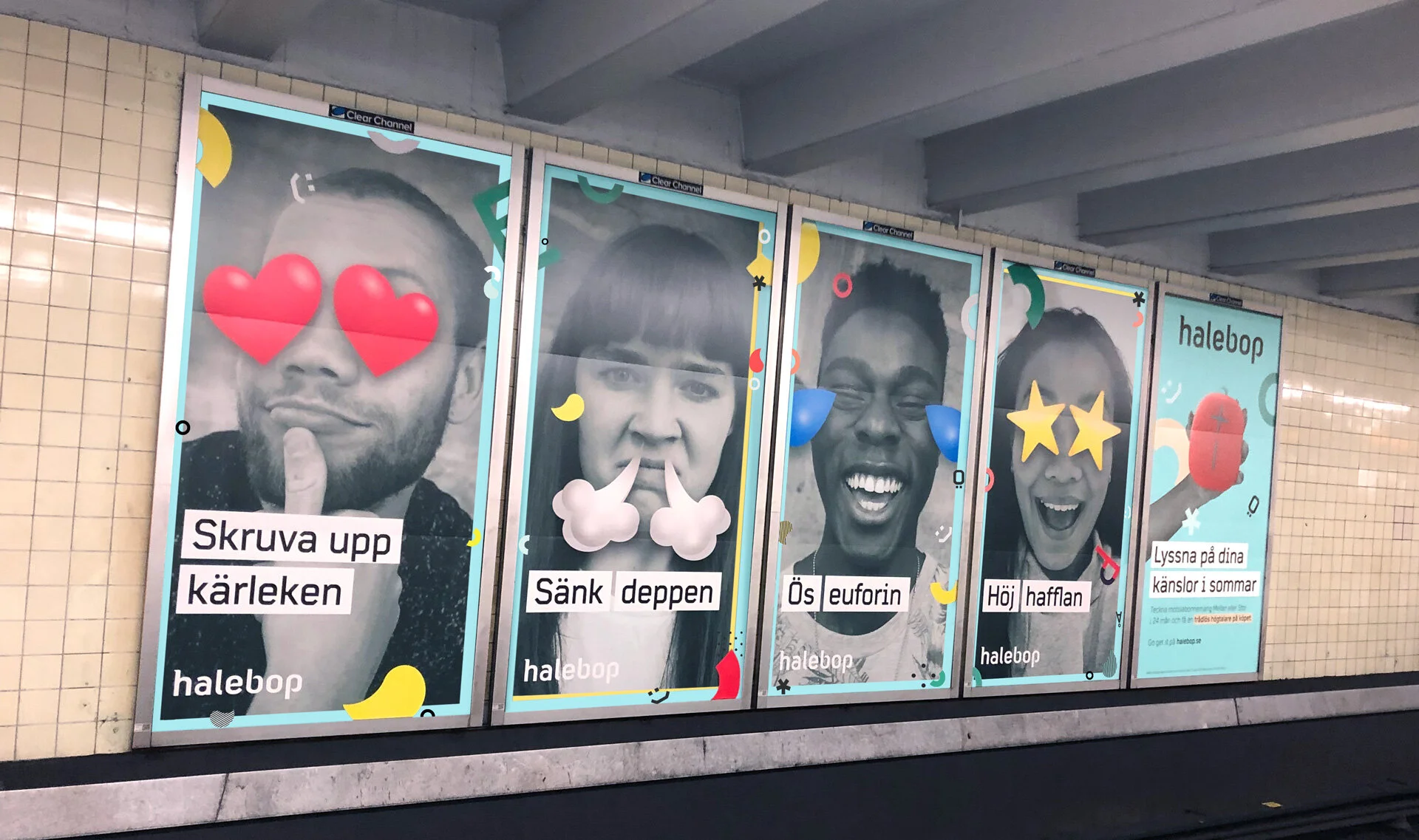
We did not want a brand that only looked good in ads. We wanted one that could move, sound, speak, and create a feeling people recognised instantly.
Think beyond the telecom category.
The identity was designed to give Halebop more range than the usual mobile operator playbook. Not just to look different, but to let the brand enter new situations, create new kinds of relevance, and feel more present in people’s lives.
Create a system with freedom in it.
Instead of locking everything into rigid rules, we built principles and modules that allowed the brand to stay consistent while still feeling alive, flexible, and responsive.
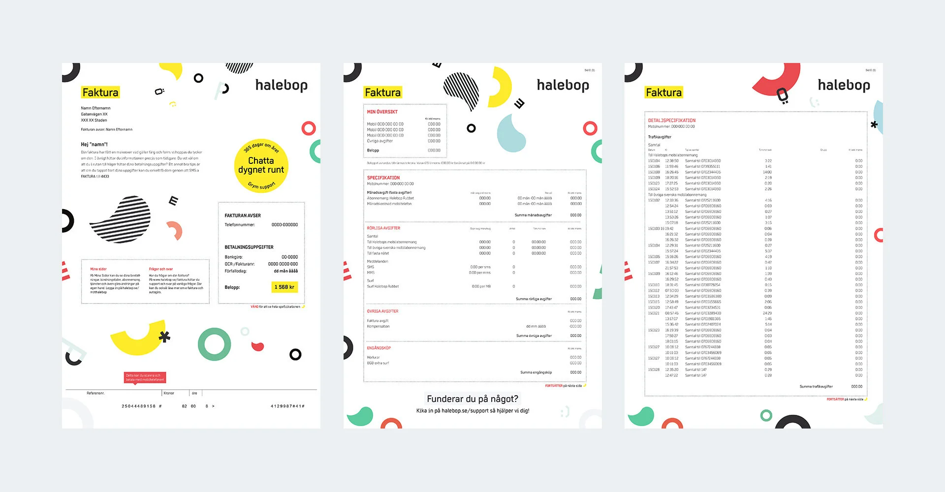
Prove it in real use.
This was not theory first. The identity was shaped through digital customer touchpoints, tested in product, and then expanded into broader communication and more experimental formats.
Outcome
The result was a more distinctive identity that increased brand recognition, won a Silver Egg in Guldägget, and expanded what Halebop could be in people’s lives. Instead of being confined to category norms, the brand gained the freedom to enter new contexts and create new kinds of relevance while still feeling unmistakably like itself.