Overview
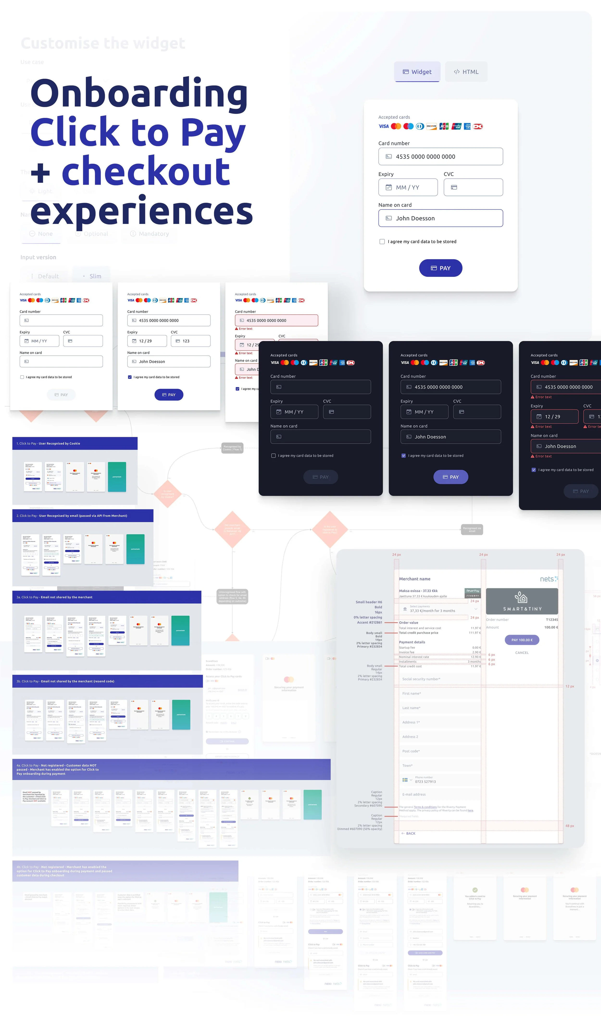
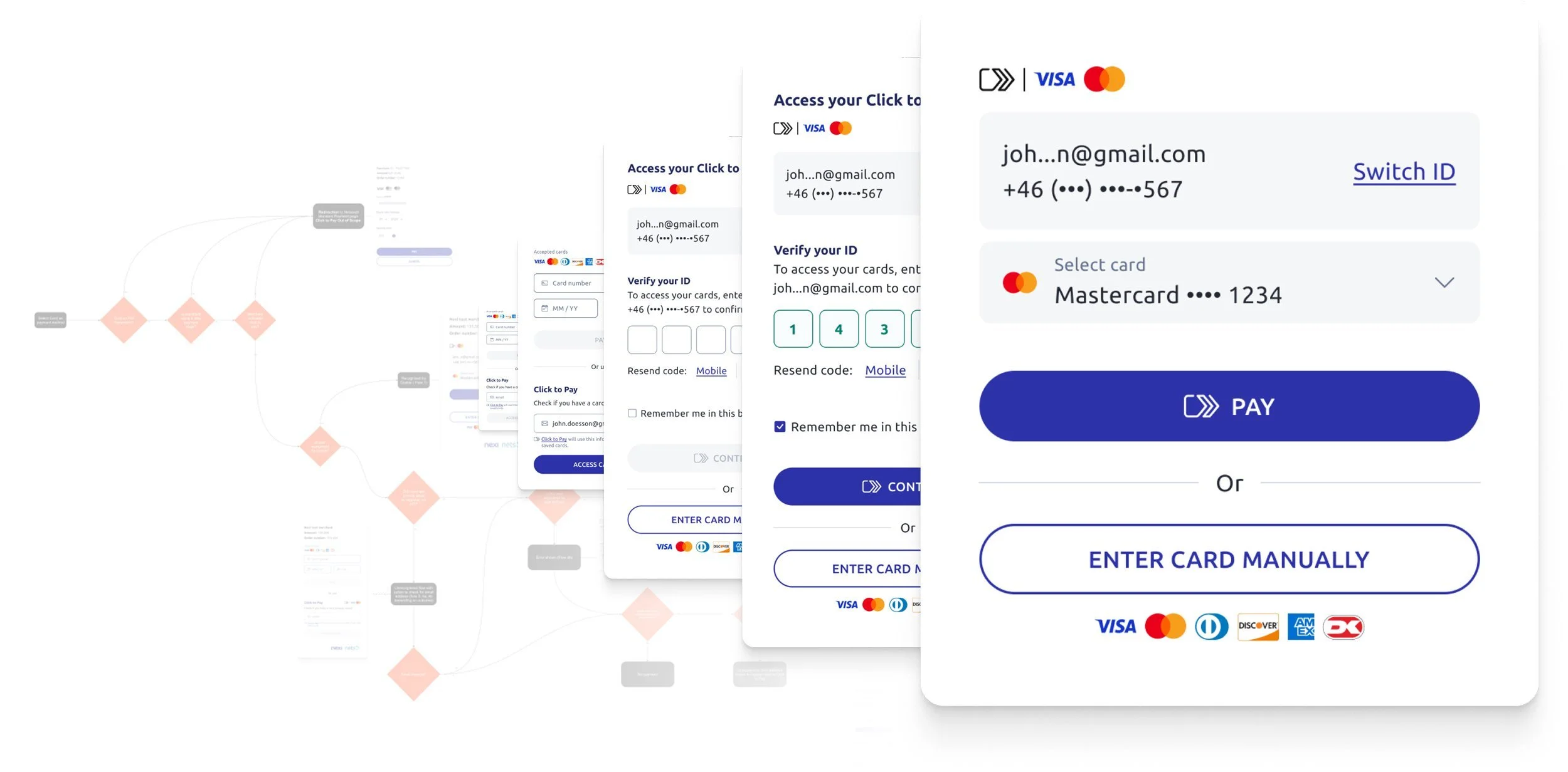
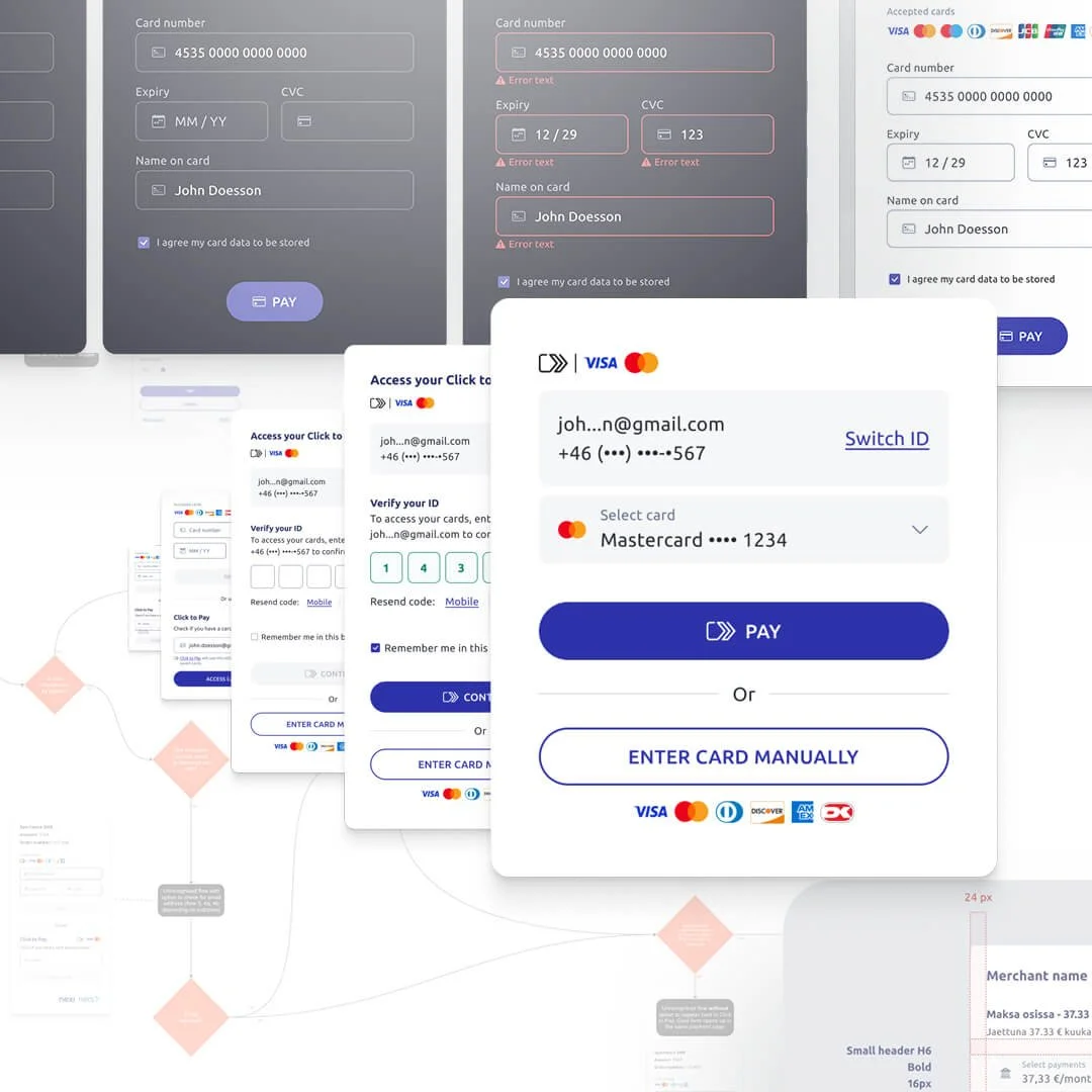
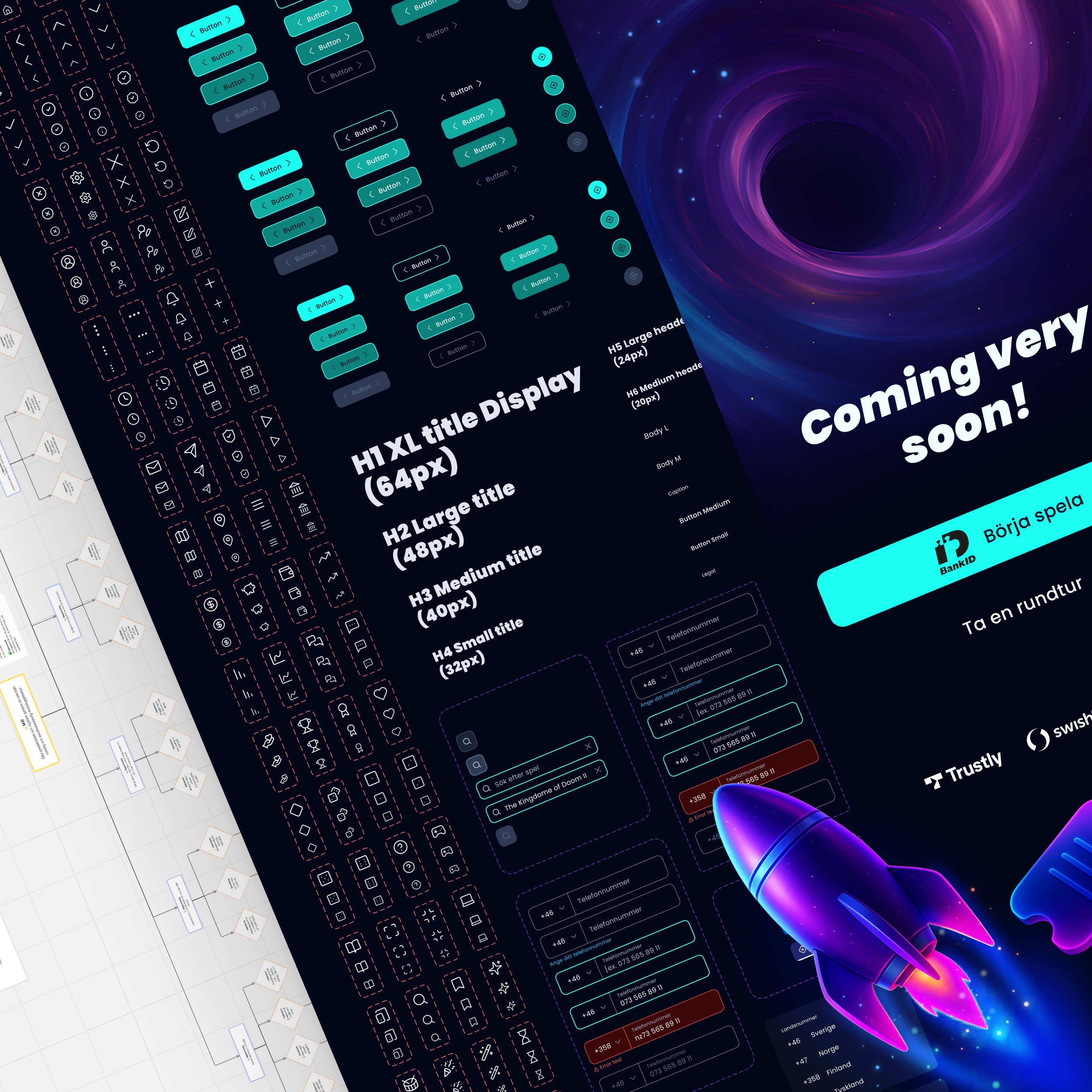
This was not just a Click to Pay integration. It was the design of a completely new checkout and payment setup, built while Click to Pay was still being introduced to market. We launched it through Nexi’s new checkout at the same time as we built the underlying system on our side, bringing Mastercard, Visa, American Express, and Discover into one coherent experience. Inside a network operating across 25+ countries, that meant designing for real scale from day one.
The challenge
The pressure came from the launch date. Click to Pay was being introduced, and we had to hit that moment with a completely new solution. At the same time, we were aligning multiple card network requirements, handling security and payment data correctly, and replacing a legacy setup with roots going back to the early 2000s. The bar was not just to launch. It was to launch something faster, clearer, and better structured than the checkout patterns merchants were already used to.
My role
I led the UX and UI work across research, behaviour analysis, journey mapping, wireframes, prototyping, interface design, and close collaboration with developers. I worked end to end across onboarding, verification, card management, and payment completion, making sure the experience stayed coherent as technical constraints, network requirements, and implementation realities kept shaping the solution.
Key decisions
Build the checkout and the payment system together.
Instead of treating Click to Pay as an add on, we built a new checkout and a new underlying setup at the same time. That created a stronger product and a cleaner foundation for future development.
Design for speed without losing trust.
The goal was not fewer steps at any cost. It was to reduce hesitation, improve clarity, and let users move through verification and payment with confidence.
Make security and data handling part of the experience.
Security, authentication, and payment data were part of the product itself. They had to be designed into the flow in a way that felt robust without making checkout feel heavy.
Push for a faster model than typical checkout flows.
Research and benchmarking helped identify where existing checkouts created friction. That shaped the hierarchy, the sequence of steps, and the way we handled onboarding, account verification, and card management.
Design for internal teams too.
This was not only about the end customer. We also needed a setup our developers could build on more cleanly over time than the legacy model it replaced.
Outcome
We shipped a completely new checkout and Click to Pay launch in seven months. More importantly, the work helped establish a stronger payment foundation inside a group operating across 25+ countries, with approximately 3.1 million terminals, 140 million cards, more than 1,000 financial institutions and over 40 billion transactions. The result was a clearer, faster, and more scalable checkout model built for security, growth, and what came next.